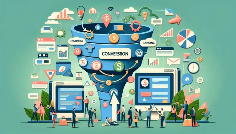
Most landing page gains do not come from redesigns. They come from fixing the handful of elements that decide whether a visitor acts now, delays, or leaves. For SEO teams, paid media buyers, publishers, and lead-gen operators, that means tightening the message match between traffic source and page, reducing form friction, clarifying the offer, and removing the points where intent leaks out of the funnel. If your page gets traffic but lead volume is flat, the issue is usually not “more visitors.” It is weak conversion mechanics.
This list ranks the landing page optimization tactics that most consistently lift leads across service businesses, SaaS, local operators, B2B campaigns, and publisher funnels. The order reflects practical impact first: tactics that affect offer clarity, form completion, qualification quality, and funnel progression sit higher than cosmetic changes. If you need more demos, quote requests, booked calls, or form fills from the traffic you already have, start at the top and work down. If you need more demos, quote requests, booked calls, or form fills from the traffic you already have, start at the top and work down, especially when optimizing your forms.
What to Look For
Prioritize tactics that change buyer behavior, not just page appearance. A useful optimization should do at least one of four things: increase relevance to the visitor’s intent, reduce the effort required to convert, increase trust at the decision point, or improve the economics of the offer. If a change cannot plausibly affect one of those levers, it is unlikely to move lead volume in a meaningful way.
Also separate lead quantity from lead quality. A shorter form can lift submissions by 20% and still damage pipeline if it attracts low-intent contacts. A more specific headline can reduce total conversions while increasing qualified opportunities. The right tactic depends on where the bottleneck sits: click-to-landing-page fit, on-page persuasion, form completion, scheduling, or sales follow-up.
1. Tighten message match from ad, email, or search intent to the page
The fastest way to lose a lead is to make the visitor re-interpret what they clicked. If the ad promises “same-day roof inspection,” the landing page cannot open with a vague “trusted exterior solutions” headline. If the keyword is “enterprise SEO audit,” the page cannot lead with a generic agency pitch. Tight message match reduces cognitive load at the top of the page and confirms the visitor is in the right place before they start scanning for risk.
Best for: PPC landing pages, local service pages, SEO pages targeting high-intent keywords, email campaign destinations.
Pros: Usually one of the highest-impact fixes because it affects bounce rate, scroll depth, and form starts at once. It also improves lead quality by filtering out mismatched clicks earlier.
Cons: Requires tighter campaign structure. Broad traffic sources often need multiple page variants, not one catch-all page.
Verdict: If your traffic is qualified but conversion rate is weak, this is the first place to look. Rewrite above-the-fold copy to mirror the exact problem, service, and outcome promised upstream.
2. Rebuild the offer so it answers “why submit now?”
Many landing pages ask for contact details before making a real offer. “Contact us” is not an offer. “Book a 15-minute teardown of your paid search waste” is. “Request pricing” is weaker than “Get a line-item estimate in one business day.” Lead generation improves when the exchange is concrete: what the visitor gets, how fast they get it, and why it is worth the interruption.
Good offers reduce ambiguity. They specify deliverable, timeframe, and buyer outcome. For service businesses, that can be a consultation with a defined agenda, a custom estimate, a free audit with named outputs, or a demo tailored to the visitor’s use case. For publishers and affiliates, it can be a gated comparison, calculator result, checklist, or quote flow with immediate utility.
Best for: B2B services, agencies, SaaS demos, quote-request pages, lead magnets that underperform.
Pros: Increases both form starts and sales-team acceptance because the lead knows what comes next. Makes follow-up easier because expectations are set before submission.
Cons: Weak teams hide behind vague offers because they cannot consistently deliver the promised next step. This tactic forces operational clarity.
Verdict: If your CTA says “submit,” “learn more,” or “contact sales,” the page is probably underperforming. Replace generic asks with a specific value exchange tied to time and outcome.
3. Cut form friction without destroying lead quality
Forms kill more leads than headlines. Every extra field adds hesitation, especially on mobile. But the fix is not always “make it shorter.” The right move is to remove fields that do not affect routing, qualification, or follow-up quality. If sales never uses “company size” on first touch, it should not be mandatory. If phone numbers are required but not used immediately, they may be suppressing completions for no return.
There are three practical ways to reduce friction: remove nonessential fields, split long forms into steps, or defer qualification until after the initial conversion. Multi-step forms often work because the first step feels low commitment and creates momentum. Hidden fields can capture campaign context without asking the user. Smart defaults, autofill support, and clear error handling matter more than most teams think.
Best for: Any page with a form completion rate that lags behind CTA clicks or form starts.
Pros: Direct, measurable effect on completion rate. Easy to test. Often produces immediate gains without redesigning the page.
Cons: Can lower lead quality if you remove the fields your team actually uses to prioritize follow-up. Requires alignment with sales, not just marketing.
Verdict: Audit every field line by line. If a field does not improve routing, qualification, or close rate, it is a candidate for removal or deferral.
4. Rewrite the hero section around a single decision, not a brand overview
The hero section has one job: help the visitor decide whether to continue. It does not need to explain your company history, every service line, and your philosophy. High-converting heroes are narrow. They state the offer, identify the audience or problem, and support the claim with one concrete proof point or mechanism. The CTA then tells the visitor what happens next.
A useful formula is simple: outcome + audience/problem + proof + next step. For example: “Get a technical SEO audit that identifies indexation waste, cannibalization, and template issues in 5 business days.” That is stronger than “We help brands grow online.” Specificity beats polish because buyers scan for fit, not slogans.
Best for: Pages with high bounce rates, low scroll depth, or brand-heavy copy above the fold.
Pros: Improves clarity immediately. Helps every traffic source because the page becomes easier to parse in seconds.
Cons: Internal stakeholders often resist specificity because it excludes edge cases. That is usually exactly why it converts better.
Verdict: If your hero could sit on any competitor’s page, it is too generic. Rewrite it so a qualified visitor understands the offer in one glance.
5. Add proof directly next to the CTA and form
Trust signals buried halfway down the page arrive too late. Visitors decide whether to risk their contact details near the CTA. That is where proof needs to sit. The most effective proof is not a logo wall alone. It is evidence tied to the claim being made: response time, number of projects delivered, average turnaround, verified review count, compliance badges, industry-specific case results, or a short testimonial that addresses the exact objection before submission.
Placement matters. A compact proof strip under the hero CTA, a testimonial beside the form, or a short “what happens after you submit” block can reduce uncertainty at the point of action. For regulated or high-ticket categories, privacy language and security reassurance can materially affect form completion.
Best for: High-consideration services, financial offers, healthcare, legal, B2B lead-gen, local businesses with trust barriers.
Pros: Low-effort change with outsized impact when trust is the real bottleneck. Helps especially when traffic is cold or unfamiliar with your brand.
Cons: Weak proof can backfire. Generic testimonials and irrelevant logos do not resolve real objections.
Verdict: Put the strongest credibility asset within a few inches of the conversion action. Proof works best at the exact moment risk peaks.
6. Align the CTA with the visitor’s stage of intent
Not every visitor is ready to “book a demo” or “talk to sales.” If the CTA asks for too much commitment too early, you lose mid-intent users who might have converted on a lower-friction next step. The fix is not adding endless options. It is matching the CTA to the traffic temperature. High-intent local service traffic can go straight to “Get My Estimate.” Colder B2B traffic may convert better on “See Sample Audit” or “Get Pricing Framework.”
CTA language should describe the outcome, not the button mechanics. “Schedule my consultation” outperforms “Submit” because it names the result. Secondary CTAs can catch visitors who are not ready, but they should support the main path, not distract from it.
Best for: Mixed-intent traffic, SEO landing pages, top-of-funnel paid campaigns, long sales cycles.
Pros: Improves click-through to forms and reduces abandonment caused by premature asks. Helps segment users by readiness.
Cons: Too many CTA paths can dilute focus and complicate attribution.
Verdict: Choose the primary CTA based on buyer readiness, not internal preference. The right ask is the one the visitor will actually accept now.
7. Use page structure that answers objections in the order buyers feel them
Most landing pages are organized around what the company wants to say, not what the buyer needs to know next. A better structure follows the decision sequence: am I in the right place, is this relevant to my problem, can I trust this claim, what exactly do I get, how much effort is required, and what happens after I submit? When sections follow that order, drop-off decreases because the page resolves uncertainty progressively instead of forcing the user to hunt for answers.
That usually means moving pricing cues, process details, turnaround expectations, FAQs, and proof higher than teams expect. If buyers always ask the same pre-sale questions, those answers belong on the page before the form, not hidden in sales calls.
Best for: Long landing pages, complex services, expensive offers, pages with strong traffic but weak conversion efficiency.
Pros: Improves conversion without changing the offer itself. Also reduces low-quality inquiries caused by unclear expectations.
Cons: Requires real user research: call transcripts, chat logs, sales objections, and heatmap data. Guessing the objection order is unreliable.
Verdict: Build the page around buyer hesitation, not brand narrative. The best-performing sections are usually the ones that remove uncertainty before it hardens into exit intent.
8. Replace stock visuals with conversion-supporting context
Images should explain, not decorate. Generic office photos waste prime screen space that could clarify the offer. Better visual assets include product screenshots, form previews, annotated deliverables, before-and-after examples, process diagrams, team photos for local trust, or short explainer clips that show exactly what the visitor gets. On service pages, a screenshot of a sample audit or report often outperforms abstract branding because it makes the offer tangible.
Visual hierarchy matters too. If the page is mobile-first, oversized images can push the CTA and proof below the fold. The right image supports the conversion path instead of delaying it.
Best for: SaaS demos, agency offers, local service pages, publisher lead-gen funnels, pages relying on abstract brand language.
Pros: Clarifies intangible offers and increases trust through transparency. Often improves time on page and CTA interaction when the asset reveals real deliverables.
Cons: Producing real assets takes effort. Poor screenshots or cluttered diagrams can add confusion instead of reducing it.
Verdict: If your visual could appear on any unrelated website, remove it. Use imagery that proves what the buyer will actually receive.
9. Reduce funnel leakage after the form submission
Lead generation does not end at the thank-you page. Many funnels lose qualified prospects because the post-submit experience is vague or slow. If the user submits and sees a generic “thanks, we’ll be in touch,” uncertainty returns. Better post-conversion flows confirm timing, next steps, and who will contact them. For appointment-driven funnels, route users directly to scheduling. For quote requests, explain turnaround and required follow-up. For lead magnets, deliver the asset instantly and present the next logical action.
This is where lead quality and sales efficiency often improve together. A clear thank-you page can filter unserious users, collect missing context, or move high-intent leads into a calendar while motivation is still high.
Best for: B2B lead forms, service businesses, demo requests, any funnel with delayed human follow-up.
Pros: Increases downstream conversion, not just top-line lead count. Shortens time-to-contact and reduces uncertainty after submission.
Cons: Requires coordination with CRM, automation, and sales operations. Many teams ignore this stage because it sits outside the landing page builder.
Verdict: Treat the thank-you page as part of the conversion path. The handoff after submission often determines whether a lead becomes a conversation.
10. Segment traffic to dedicated pages instead of forcing one page to serve everyone
A single landing page rarely converts equally well for branded search, non-brand SEO, retargeting, partner traffic, and cold paid campaigns. Different audiences arrive with different awareness levels, objections, and desired outcomes. Segmenting traffic into dedicated pages lets you tailor the headline, proof, CTA, and form depth to the visitor’s context. That usually produces cleaner message match and better qualification.
Segmentation can be by industry, service, use case, location, funnel stage, or traffic source. For example, a legal intake page for motor vehicle accidents should not share the same copy path as a general personal injury contact page. A SaaS page for agencies should not mirror one for in-house teams if the workflow and ROI case differ.
Best for: Accounts with multiple audiences, mixed acquisition channels, or broad service catalogs.
Pros: Raises relevance and often increases both conversion rate and sales acceptance. Supports cleaner testing because each page has a narrower job.
Cons: More pages to maintain. Thin differentiation creates duplication without real performance gain.
Verdict: If one page is trying to speak to everyone, it is probably converting no one as well as it should. Split the page when traffic intent materially differs.
11. Test pricing cues, qualification language, and expectation-setting
Some of the biggest lifts come from being clearer about fit. Teams often hide pricing, minimums, timelines, or service boundaries to avoid scaring people off. That can increase raw leads while lowering close rate and wasting sales time. In many cases, adding qualification language improves funnel efficiency because the right buyers self-select in and the wrong ones self-select out.
This does not always mean publishing full pricing. It can mean stating “projects typically start at $5,000,” “best fit for teams spending $20k+/month on ads,” or “available in select service areas.” The point is to reduce mismatch before the form, not after a sales call.
Best for: High-ticket services, agencies, local businesses with service-area limits, B2B offers with clear minimum viable fit.
Pros: Improves lead quality, sales efficiency, and close-rate potential. Cuts down on unqualified submissions that inflate vanity metrics.
Cons: Can reduce total lead volume. Stakeholders focused only on top-line form fills may resist it.
Verdict: If sales complains about bad leads, test clearer fit criteria on-page. Fewer but better inquiries usually outperform a larger pile of weak submissions.
12. Run disciplined A/B tests on high-impact elements, not random page tweaks
Testing works when the hypothesis is tied to a conversion bottleneck. It fails when teams test button colors while the offer is weak and the form is too long. Start with the elements most likely to change user behavior: headline, offer framing, CTA language, form length, proof placement, and page structure. Measure not just form fills but qualified leads, booked calls, and pipeline contribution where possible.
Good tests isolate one meaningful variable and run long enough to avoid false positives. They also account for traffic source differences. A variant that wins on branded traffic may lose on cold paid traffic because the user arrives with different trust and intent levels.
Best for: Teams with enough traffic to reach significance and a clean analytics setup.
Pros: Turns optimization into a repeatable process instead of opinion battles. Builds a body of evidence you can reuse across campaigns and page templates.
Cons: Low-traffic pages may never produce reliable test results. Poor tracking can make a “winning” test meaningless.
Verdict: Test the variables that shape buyer decisions, then judge winners by revenue quality, not just superficial conversion rate lifts.
How to measure success and choose the right tactic first
Start by locating the exact leak. If click-through to the landing page is solid but bounce rate is high, focus on message match and the hero section. If users click the CTA but abandon the form, reduce friction and improve field logic. If form fills rise but sales rejects the leads, tighten the offer, qualification language, and post-submit routing. If traffic is mixed, segment audiences into dedicated pages before testing smaller changes.
Track at least four layers: visitor-to-CTA click rate, form start rate, form completion rate, and qualified lead rate. For appointment funnels, add booking rate and show rate. For sales-led funnels, connect page variants to pipeline value, not just lead count. A page that converts at 6% but produces poor-fit leads is weaker than a page that converts at 4% and doubles qualified opportunities.
One practical rule: fix clarity before design, fix friction before adding traffic, and fix qualification before celebrating higher lead volume. That sequence protects both conversion rate and revenue quality.
FAQ
What is the single most important landing page optimization tactic?
For most campaigns, it is message match. If the page does not immediately confirm the visitor clicked into the right solution, every downstream element performs worse, including trust signals, CTA clicks, and form completions.
Should I always shorten my lead form?
No. Remove fields that do not improve routing or qualification, but keep the fields that help sales act fast and prioritize correctly. The right form is the shortest version that still protects lead quality.
How long should a landing page be?
As long as needed to resolve the buyer’s main objections before the CTA. Low-risk local offers may convert on short pages. Expensive B2B services usually need more proof, process detail, and qualification context.
Do testimonials still help conversion rates?
Yes, when they are specific and placed near the decision point. The best testimonials address a real objection such as turnaround, ROI, communication quality, or ease of implementation. Generic praise does little.
What should I test first on a low-converting page?
Start with the headline, offer, CTA language, and form length. Those elements usually have more impact than visual polish because they change how the visitor interprets the value exchange.