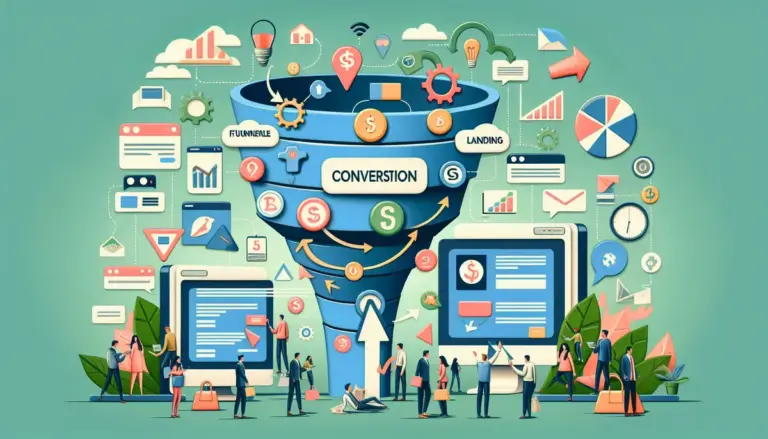
Ecommerce CRO in 2026 is less about broad “optimization” and more about fixing the exact leaks between traffic, product discovery, cart intent, checkout completion, and repeat purchase. Brands that win are not simply testing button colors. They are tightening landing page-message match, reducing form friction, restructuring offers, personalizing funnels by traffic source, and measuring lift at the revenue-per-session level instead of celebrating shallow click gains. If you run paid traffic, manage a catalog with uneven product demand, or depend on email and SMS to recover margin, the right CRO strategy is the one that removes purchase hesitation without adding operational complexity. This focus on user experience extends to reducing form friction, a key element in smooth transactions.
That matters because most ecommerce stores do not have a traffic problem first. They have a conversion architecture problem. Product pages bury proof, collection pages force too many decisions, mobile forms ask for unnecessary input, and promotions train discount dependence. The strategies below are ranked by commercial impact, implementation practicality, and how reliably they improve landing page performance, checkout completion, average order value, and funnel efficiency for real stores. Many sites suffer from a fundamental conversion architecture problem that hinders overall performance.
What to Look For
Prioritize strategies that can be tied to a measurable stage in the funnel. If a change cannot be mapped to product page engagement, add-to-cart rate, checkout start, checkout completion, AOV, or revenue per visitor, it is easy to misread noise as progress. Also look for changes that can be deployed on your highest-intent pages first: paid landing pages, best-selling PDPs, cart, checkout, and lead-capture forms tied to first-order offers. In ecommerce, the fastest wins usually come from pages with existing traffic and visible abandonment, not from sitewide redesigns.
1. High-intent landing pages matched to ad and email traffic
The highest-return CRO move for most ecommerce brands is building dedicated landing pages for traffic segments instead of sending every click to a generic collection page or homepage. A paid search visitor looking for “women’s waterproof trail running shoes” should not land on a broad footwear category with 96 products and three competing banners. A segmented landing page can narrow the assortment, mirror the ad language, present the primary benefit above the fold, and route the visitor into a shorter buying path. This usually lifts conversion because it removes decision fatigue and preserves message continuity from click to purchase.
Best for: Brands running Google Ads, Meta campaigns, affiliate traffic, influencer drops, and promotional email sends.
Pros: Better message match, lower bounce rate, cleaner attribution by campaign, easier testing of offers and page structure, and more control over mobile-first buying journeys.
Cons: Requires more page variants, tighter campaign governance, and regular merchandising updates to keep pages aligned with inventory and seasonality.
Verdict: If you still route paid traffic to generic category pages, start here before touching smaller UX details. The lift is often larger because you fix intent mismatch at the top of the funnel instead of trying to recover lost visitors later.
2. Product pages rebuilt around proof, objections, and buying momentum
Most product detail pages still read like catalog entries when they should function like sales pages. The best-performing PDPs in 2026 do three things fast: confirm the product is relevant, answer the top purchase objections, and create a clear next step. That means stronger first-screen hierarchy, visible delivery and returns information, proof close to the add-to-cart button, variant clarity, usage context, and objection-handling content such as sizing guidance, material detail, compatibility, or care instructions. If shoppers need to scroll, expand tabs, or leave the page to answer basic purchase questions, conversion drops.
Best for: Stores with healthy product traffic but weak add-to-cart rates or high PDP exits.
Pros: Improves add-to-cart rate, reduces customer support friction, increases confidence on mobile, and creates a better base for paid traffic profitability.
Cons: Requires customer research, review mining, heatmaps, and product-specific merchandising rather than one universal template.
Verdict: Treat the PDP as the core conversion asset, not a data sheet. For many brands, a sharper proof-and-objection structure on the top 20 products outperforms broad site redesign work.
3. Checkout form reduction and field logic cleanup
Checkout conversion is still lost on avoidable form friction. In 2026, brands that convert better are stripping checkout to the minimum required data, using smart defaults, collapsing optional fields, enabling wallet payments early, and removing interruptions that force users to stop and think. Every extra field, validation error, and awkward keyboard switch on mobile adds abandonment risk. The practical work here is specific: reduce address friction, remove duplicate inputs, make promo code fields less distracting, preload country logic where possible, and surface shipping costs early enough to avoid late-stage surprise.
Best for: Mobile-heavy stores, brands with strong add-to-cart volume but weak checkout completion, and international stores with address complexity.
Pros: Fast impact on completed orders, lower abandonment, fewer form errors, and stronger mobile performance without changing traffic quality.
Cons: Platform constraints can limit checkout edits, and some teams over-test microcopy while ignoring structural friction.
Verdict: If checkout abandonment is high, do not start with persuasion experiments. Remove friction first. A cleaner form flow usually beats more aggressive urgency messaging.
4. Offer architecture that protects margin while increasing first-order conversion
Blanket discounts are lazy CRO. Better ecommerce brands structure offers based on threshold behavior, product economics, and customer acquisition source. Instead of “10% off everything,” they test first-order bundles, gift-with-purchase thresholds, free shipping breakpoints, category-specific incentives, and timed post-opt-in offers that move hesitant buyers without resetting price expectations across the store. The point is not simply to increase conversion rate. It is to increase profitable conversion rate.
Best for: Brands with rising acquisition costs, margin pressure, or heavy dependence on discounting to close first-time buyers.
Pros: Can lift conversion and AOV at the same time, reduces over-discounting, creates cleaner promotional logic, and supports better email/SMS capture flows.
Cons: Needs margin modeling, inventory awareness, and careful QA so offers do not conflict across ads, onsite banners, and checkout.
Verdict: Rework the offer before you increase the discount. In many stores, a threshold-based incentive or bundle converts nearly as well as a blanket markdown while preserving more contribution margin.
5. Email and SMS capture flows tied to buying stage, not generic popups
Most list-growth forms still interrupt badly and ask for too much too early. The better strategy is to match capture timing and incentive to visitor intent. New cold traffic may respond to a first-order offer or category guide. Returning visitors may need a restock alert, bundle reminder, or shipping threshold prompt. Cart-stage users often convert better with exit-intent capture tied to a practical objection such as delivery timing or size help, not another generic discount. Form design matters too: fewer fields, single-purpose copy, visible value exchange, and mobile-safe interaction patterns.
Best for: Brands investing in lifecycle revenue, repeat purchase, and abandoned-cart recovery.
Pros: Increases owned audience growth, supports lower paid media dependence, and creates more ways to recover non-buyers after the first session.
Cons: Poorly timed popups can hurt conversion, and weak segmentation turns captured leads into low-value subscribers.
Verdict: Capture should support the sale, not interrupt it. If your popup strategy is one offer shown to everyone, you are likely sacrificing immediate conversion and list quality at the same time.
6. Collection page simplification for faster product discovery
Collection pages often underperform because they force users into a browse-heavy experience when many visitors are ready to narrow quickly. The fix is not endless filter expansion. It is better sorting logic, cleaner product-card information, fewer competing promotional blocks, and stronger category framing based on the shopper’s likely decision criteria. For apparel that may be fit, use case, or fabric. For beauty it may be concern, skin type, or routine step. For home goods it may be room, size, or material. The page should help users self-select fast instead of making them inspect dozens of options.
Best for: Large catalogs, fashion and beauty brands, and stores with high category traffic but weak PDP click-through.
Pros: Better product discovery, higher PDP visits, lower bounce from category pages, and stronger mobile browsing efficiency.
Cons: Requires merchandising discipline and customer-language alignment; too many filters can still create friction if the hierarchy is weak.
Verdict: If collection pages are acting like cluttered shelves, simplify the path to relevance. Better category UX often unlocks conversion without changing the product page at all.
7. Cart pages engineered to resolve hesitation, not just summarize items
The cart is one of the most underused conversion surfaces in ecommerce. Too many stores treat it as a passive review page when it should actively remove the final reasons not to buy. Effective cart optimization includes visible shipping thresholds, clear delivery expectations, trust and returns reassurance, low-friction quantity edits, contextual cross-sells, and objection-handling microcopy that does not feel like a hard sell. The cart should make the next step obvious and reduce uncertainty before checkout begins.
Best for: Stores with strong add-to-cart rates but weak checkout starts or high cart abandonment.
Pros: Improves checkout initiation, lifts AOV through relevant add-ons, and reduces drop-off caused by surprise costs or uncertainty.
Cons: Overloading the cart with upsells or banners can distract from checkout and lower completion.
Verdict: Use the cart to answer final purchase questions and reinforce value. Do not turn it into a promotional dumping ground that delays checkout.
8. Social proof placement based on objection timing
Reviews work best when placed where doubt appears, not where the design team has empty space. That means summary proof near the buy box, specific proof near product claims, UGC where fit or real-world use matters, and post-cart reassurance where trust is the issue. A skincare brand may need before-and-after evidence near concern-based claims. A furniture brand may need delivery and assembly feedback near checkout intent. A supplements brand may need subscription-proof and repeat-use context, not just star ratings. Placement should follow the decision path.
Best for: Products with trust barriers, premium pricing, unfamiliar benefits, or high comparison behavior.
Pros: Increases confidence, supports premium positioning, and helps reduce uncertainty without relying on discounts.
Cons: Generic review widgets can add clutter; weak or irrelevant proof can actually highlight doubt.
Verdict: More reviews are not the goal. Better proof placement is. Put the right evidence next to the exact claim or hesitation that blocks purchase.
9. Mobile-first speed and interaction fixes on revenue pages
Site speed still matters, but the commercially useful version of this strategy is narrower than broad technical audits suggest. Focus on the pages where revenue is won or lost: paid landing pages, top PDPs, cart, and checkout. Compress heavy media, defer noncritical scripts, reduce app bloat, simplify sticky elements, and test tap targets, keyboard behavior, and image loading on real devices. A store can pass generic performance benchmarks and still lose sales because the add-to-cart button jumps, a size selector lags, or a popup blocks the viewport on smaller screens.
Best for: Mobile-dominant brands, image-heavy catalogs, and stores with a large stack of third-party apps.
Pros: Better conversion on mobile, lower abandonment from interaction lag, and cleaner paid traffic economics because fewer sessions are wasted.
Cons: Requires prioritization; teams often spend months on low-impact technical cleanup instead of fixing revenue pages first.
Verdict: Speed work should follow the money. Improve the interactions on your highest-value pages before chasing sitewide perfection scores.
10. Personalization by traffic source, customer state, and product intent
Personalization is useful when it changes the offer, proof, or path to purchase in a way that matches intent. It is not useful when it merely swaps headlines for novelty. Returning customers should not see the same first-order incentive as new visitors. Paid social traffic may need stronger education and proof than branded search traffic. High-AOV products may require financing visibility, comparison support, or consultation prompts. Repeat buyers may respond better to replenishment bundles or subscription nudges. The key is to personalize around buying friction, not vanity segmentation.
Best for: Brands with multiple acquisition channels, repeat purchase behavior, or broad product ranges serving different use cases.
Pros: More relevant offers, cleaner funnel progression, and better monetization of traffic segments with different intent levels.
Cons: Bad segmentation creates noise, and teams often overcomplicate rules before validating simpler audience splits.
Verdict: Start with three or four high-value segments and change one meaningful element per segment. Personalization works when it reduces friction, not when it increases production overhead.
11. Post-purchase upsells and reorder flows that extend session value
CRO does not stop at the thank-you page. Brands that improve total revenue per customer use post-purchase moments to capture incremental value without risking the initial sale. That includes one-click upsells, accessory offers, replenishment prompts, subscription conversion after first purchase, and onboarding flows that reduce refund risk while setting up second-order behavior. This is especially effective for consumables, accessories, and products with natural attach rates. The best flows are tightly matched to what was just purchased and presented with minimal decision load.
Best for: Consumables, beauty, pet, wellness, accessories, and stores with clear cross-sell logic.
Pros: Increases AOV and LTV, improves acquisition efficiency, and creates more revenue without adding top-of-funnel spend.
Cons: Irrelevant upsells feel opportunistic and can hurt brand trust; offer sequencing needs careful testing.
Verdict: If CAC is climbing, squeeze more value from completed orders before buying more traffic. Post-purchase optimization often delivers cleaner profit than another discount-led acquisition campaign.
12. Test prioritization based on revenue impact, not experiment volume
Many ecommerce teams run too many low-stakes tests and learn very little. The better strategy is a ranked testing system that scores ideas by page traffic, funnel proximity, implementation cost, and expected revenue impact. A checkout field reduction test on a high-volume store is usually worth more than five homepage hero experiments. A PDP proof-placement test on a best-seller may matter more than a broad navigation redesign. The goal is not to brag about testing velocity. It is to compound wins on the pages and offers that drive the most money.
Best for: In-house ecommerce teams, agencies, and brands already running tests but seeing inconsistent business impact.
Pros: Better use of development time, clearer reporting, and more commercially relevant experimentation.
Cons: Requires discipline, clean analytics, and willingness to ignore interesting but low-value ideas.
Verdict: Fewer, better-ranked tests usually outperform a busy experimentation calendar. Prioritize by revenue leverage, not by how easy a test is to launch.
How to measure success and choose the right strategy
Pick the strategy that matches the bottleneck you can already see in the funnel. If traffic is landing but not engaging, fix landing page-message match and collection page relevance. If PDP traffic is healthy but add-to-cart is weak, rebuild proof, objection handling, and product page hierarchy. If carts are full but orders are not closing, reduce checkout friction and clarify shipping, returns, and payment options. If first orders are expensive to acquire, improve offer design, capture flows, and post-purchase monetization.
Measure each change against a primary metric and one or two guardrails. For example, a PDP test might target add-to-cart rate while monitoring AOV and refund rate. A checkout form change should track checkout completion and error rate. An offer test should measure conversion rate, AOV, gross margin per order, and revenue per visitor. Avoid declaring wins from click-through improvements alone if they do not produce more completed orders or better contribution margin.
Use holdout periods where possible, segment by device, and review results by traffic source. Many ecommerce changes look positive in aggregate but only work on desktop, only help branded traffic, or only improve discounted sessions. The right CRO strategy is the one that lifts profitable conversion in the audience that matters most to your growth plan.
FAQ
What is the fastest CRO win for most ecommerce brands?
Usually one of three things: better landing page-message match for paid traffic, stronger proof and objection handling on top PDPs, or checkout field reduction on mobile. These areas sit close to revenue and often show measurable movement faster than broad redesigns.
Should ecommerce brands focus on conversion rate or average order value?
Both, but not in isolation. A test that lifts conversion while cutting AOV or margin can hurt profit. Track revenue per visitor, gross margin per order, and completed orders together so you do not optimize toward a weaker commercial outcome.
How many CRO tests should an ecommerce store run at once?
Only as many as you can measure cleanly and implement without overlap. For many stores, one to three high-impact tests on core revenue pages is more useful than a crowded roadmap full of low-traffic experiments.
Are discounts still necessary for conversion growth in 2026?
Sometimes, but they should be structured carefully. Threshold offers, bundles, gifts, and audience-specific incentives often produce similar conversion lift with less margin damage than blanket percentage discounts.
What pages should be optimized first?
Start with the pages that combine high traffic and high purchase intent: paid landing pages, best-selling product pages, cart, checkout, and lead-capture forms tied to first-order offers. That is where conversion gains usually show up fastest.