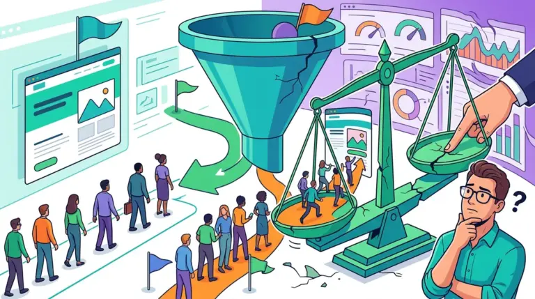
Most performance marketers spend 90% of their budget on traffic acquisition and less than 5% on optimizing the destination. This imbalance creates a ceiling on ROI that no amount of keyword bidding or creative refreshing can fix. When a landing page converts at 2.1% and the industry average is 5%, the problem isn't the traffic; it’s the friction inherent in the page design. A/B testing is the process of systematically removing that friction, but the sequence in which you test elements determines whether you see a 5% lift or a 50% breakthrough. Understanding what to test first can significantly accelerate your learning curve and improve page performance.
To move the needle, you must prioritize high-leverage elements that change the user’s perception of value or risk. Testing a hex code on a button might yield a statistically significant result over six months, but testing a radical change in your primary offer can double your lead volume in a week. Success in CRO (Conversion Rate Optimization) requires moving from cosmetic changes to structural and psychological pivots.
The Primary Offer and Value Proposition
The offer is the single most influential variable on any landing page. If the underlying deal doesn't resonate with the audience's pain points, no amount of copy polishing will save the campaign. Marketers often mistake the "product" for the "offer." The product is what you sell; the offer is how the user accesses it and what they get in return for their contact information or credit card.
Variables to test:
- Hard Offer vs. Soft Offer: Compare a "Book a Demo" CTA (high friction, high intent) against a "Watch a 2-Minute Walkthrough" (low friction, medium intent).
- Pricing Models: Test a flat monthly fee against a "pay-as-you-go" or tiered structure to see which reduces the barrier to entry.
- Incentives: Compare a 14-day free trial with no credit card required against a 30-day money-back guarantee.
- The Hook: Shift the focus from "Save 20% on overhead" to "Stop losing $5,000 a month to inefficient billing."
Headline Clarity vs. Creative Hooks
The headline is the first—and often only—piece of copy a visitor reads. Its primary job is to confirm that the visitor is in the right place and that the page solves their specific problem. A common mistake is using "clever" or "branded" headlines that obscure the actual benefit. A/B testing should pit clarity against creativity.
Try testing a benefit-driven headline (e.g., "Get Your Taxes Done in 15 Minutes") against a loss-aversion headline (e.g., "Stop Overpaying the IRS Every April"). In most B2B contexts, clarity wins. However, in lifestyle or consumer categories, emotional hooks often outperform dry descriptions. Measure not just the click-through rate, but the scroll depth to see if the headline successfully pulled the user further into the narrative.
Warning: Avoid "Testing for the sake of testing." If your page receives fewer than 500 conversions per month, you lack the statistical power to test minor elements like button colors or font sizes. Focus on radical redesigns or offer pivots that produce large delta changes in behavior. Be aware of common mistakes that skew results, as they can lead you down unproductive testing paths.
Call to Action (CTA) Friction and Language
The CTA is the pivot point where a visitor becomes a lead. Most pages default to generic language like "Submit," "Sign Up," or "Register." These words imply work or commitment without highlighting the reward. High-performing A/B tests often focus on "Value-Based CTAs" that mirror the user's desired outcome.
Instead of "Download Ebook," test "Send Me the PDF." Instead of "Contact Sales," test "Check Availability." The goal is to reduce the perceived "cost" of the click. Additionally, the physical placement of the CTA matters. Test a "sticky" header CTA that follows the user as they scroll versus a single large button at the bottom of the hero section. For long-form sales pages, repeating the CTA at every major transition point often captures users at different stages of their decision-making process.
Form Structure and the Breadcrumb Technique
Forms are where most conversions die. Every field you add to a form typically decreases the conversion rate, but fewer fields often lead to lower lead quality. A/B testing allows you to find the "Goldilocks zone" where volume and quality intersect.
One of the most effective tests involves the "Breadcrumb Technique." This involves breaking a long, intimidating form into multiple steps. The first step should ask for non-threatening, low-friction information (e.g., "What is your primary goal?"). Once the user has committed to the first two steps, they are psychologically more likely to provide their email and phone number in the final step to "complete" the process. Test a single-step 5-field form against a three-step multi-page form to measure the completion rate vs. the drop-off rate.
Social Proof and Trust Signals
Trust is the invisible currency of the internet. If a visitor doesn't believe your claims, your offer is irrelevant. However, not all social proof is created equal. A generic quote from "John D." is far less effective than a verified testimonial with a headshot, full name, and company logo.
Specific elements to test:
- Quantity vs. Quality: Test a wall of 20 short testimonials against 3 deep-dive case study snippets.
- Authority Logos: Compare "As seen in" media logos against "Trusted by" client logos.
- Real-Time Data: Test the inclusion of a "Verified Purchase" badge or a live notification showing that "Sarah from Chicago just signed up."
- Negative Social Proof: Paradoxically, showing a 4.7-star rating can sometimes convert better than a perfect 5.0, as it feels more authentic to a skeptical audience.
Visual Hierarchy and Hero Imagery
The visual flow of a page dictates what the user perceives as important. A/B testing different hero images can significantly impact the "vibe" of the brand. For software, test a high-fidelity screenshot of the dashboard against a lifestyle photo of a person looking relieved while using the product. The former appeals to the logical, feature-focused buyer; the latter appeals to the emotional, outcome-focused buyer.
Directional cues are another high-impact visual test. If your hero image features a person, test having them look directly at the user versus looking toward the CTA button. Human eyes naturally follow the gaze of others, and subtle shifts in eye-line can drastically increase the "noticeability" of your form or button.
How to Prioritize Your Testing Roadmap
Do not test everything at once. This leads to "noisy" data where you cannot isolate which change caused the lift. Start with the "Big Rocks": the offer, the headline, and the form structure. Only once these are optimized should you move to the "Pebbles": button colors, micro-copy, and secondary imagery.
Use the PIE framework (Potential, Importance, Ease) to score your ideas. Potential: How much improvement can be made on this page? Importance: How valuable is the traffic going to this page? Ease: How difficult is it to implement this test? Start with the high-potential, high-importance, high-ease tasks to generate quick wins that fund more complex experimentation.
A/B Testing Frequently Asked Questions
How long should I run an A/B test?
Most tests should run for at least two full business cycles (usually two weeks) to account for variations in traffic behavior between weekdays and weekends. You must reach a statistical significance of at least 95% before declaring a winner to ensure the results aren't due to random chance.
What if my test results are "inconclusive"?
Inconclusive results are still data. They suggest that the element you tested isn't a primary driver of the user's decision-making process. If a headline change doesn't move the needle, the problem likely lies deeper—either in the offer itself or the quality of the traffic being sent to the page.
Should I test mobile and desktop users separately?
Yes. User intent and browsing behavior differ significantly between devices. A long-form page might convert well on desktop where users are in "research mode," while a condensed, high-speed version might be necessary for mobile users on the go. Always segment your data to see if a "losing" test on desktop was actually a "winner" on mobile.
Can I test more than two versions at once?
This is known as A/B/n testing. While possible, it requires significantly more traffic to reach statistical significance. If you have 10,000+ conversions a month, go for it. If you are a smaller operation, stick to a clean A/B split to get answers faster.