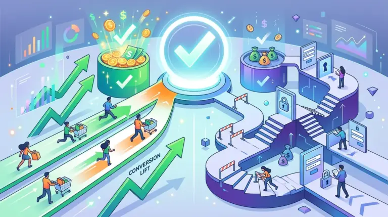
The checkout page is the most expensive square inch of your digital real estate. By the time a user reaches this stage, you have already paid for the traffic, optimized the product page, and secured the "Add to Cart" click. Yet, the average cart abandonment rate hovers around 70%. Most of these exits are not due to a change of heart, but rather a reaction to friction: unexpected costs, forced account creation, or a form that feels like a tax audit.
To move the needle on completion rates, you must stop treating the checkout as a data collection tool and start treating it as a closing tool. Every field, button, and line of microcopy must serve one purpose: moving the user to the "Thank You" page with the least amount of cognitive load possible.
Eliminating the Mandatory Account Wall
Forcing a user to create an account before they can give you money is the most effective way to kill a conversion. Research consistently shows that "Guest Checkout" is the single most important feature for high-velocity e-commerce. When you demand a password and email verification upfront, you interrupt the buying momentum and introduce a security concern ("Do I want another site holding my data?").
Best for: Direct-to-consumer (DTC) brands and low-frequency purchase sites where brand loyalty hasn't been established yet.
Instead of a mandatory wall, offer account creation on the order confirmation page. At that point, you already have their name, email, and address. A simple "Save your details for next time" checkbox with a password field is a low-friction way to capture the lead without risking the sale.
Radical Form Field Reduction
Every additional form field increases the probability of abandonment. Most checkout templates are bloated with legacy fields that serve internal logistics rather than the customer experience. If a piece of data isn't required to ship the product or process the payment, delete it.
- Combine Name Fields: Use a single "Full Name" field instead of separate first and last name inputs. This reduces the number of taps on mobile devices.
- Default Billing to Shipping: Always assume the billing address is the same as the shipping address. Hide the billing fields behind a single checkbox that is checked by default.
- Address Autocomplete: Implement the Google Places API or a similar service. This allows users to find their address in three keystrokes rather than typing out the street, city, state, and zip code manually.
- Hide Coupon Codes: An empty, prominent "Enter Promo Code" box signals to the user that they are potentially overpaying. This often triggers a site exit as the user goes to Google to hunt for a discount. Use a text link like "Have a code?" to keep this feature discreet.
Pro Tip: Use inline validation to catch errors in real-time. Waiting until the user clicks "Submit" to show a red error message at the top of the page is a major friction point. Green checkmarks next to completed fields provide positive reinforcement and guide the user through the process.
Visual Hierarchy and Trust Placements
Trust is not a static feeling; it fluctuates throughout the checkout process. The moment a user is asked for their credit card number, their anxiety spikes. This is where trust signals must be most prominent. Do not bury your security badges in the footer. Place them directly adjacent to the payment input fields.
The visual hierarchy should emphasize the total cost and the "Complete Purchase" button. If your checkout page is cluttered with navigation links, "Related Products," or newsletter signups, you are providing exits. A "distraction-free" checkout—where the header and footer are stripped of all links—keeps the user focused on the transaction.
Mobile-First Input Optimization
If your checkout requires a user to pinch-and-zoom or manually switch to a numeric keyboard, you are losing mobile revenue. Optimization here is technical, not just visual. Ensure your HTML tags use the correct input types:
Best for: Increasing speed on mobile devices where typing is prone to error.
Use type="tel" for phone numbers and type="number" for zip codes to trigger the numeric keypad automatically. Furthermore, ensure that the "Pay Now" button is "sticky" or positioned within the natural thumb zone at the bottom of the screen. Mobile users should be able to complete the entire process without having to reach for the top corners of their device.
The Multi-Step vs. Single-Page Debate
There is no universal winner between single-page and multi-step checkouts, but the decision should be based on your average order value (AOV). For low-cost, impulsive purchases, a single-page checkout reduces the perceived effort. For high-ticket items (over $500), a multi-step checkout can actually perform better by breaking the process into digestible "micro-commitments."
If using a multi-step approach, a progress bar is mandatory. It should be clickable, allowing users to jump back to previous steps without using the browser's back button, which often breaks form data and causes frustration.
Payment Method Diversity
The "standard" credit card form is becoming the backup option for many users. Digital wallets like Apple Pay, Google Pay, and PayPal Express allow users to bypass the entire form-filling process by pulling saved data directly from their device. In many tests, adding "Express Checkout" buttons at the top of the page increases conversion rates by 10% or more because it eliminates the need for a physical wallet.
Immediate Implementation Checklist
To see an immediate lift in completion rates, audit your current checkout against these three high-impact changes. First, verify that your shipping costs are shown as early as possible; "sticker shock" at the final step is the leading cause of cart abandonment. Second, ensure your "Complete Purchase" button uses high-contrast colors that stand out from the rest of the page. Third, test your checkout on a slow 3G connection. If the page takes more than three seconds to load, your technical overhead is costing you sales.
Checkout Optimization FAQ
Should I show shipping costs on the product page or the checkout page?
Transparency is always better. If possible, provide a shipping calculator on the cart page or offer a flat-rate/free shipping threshold. Waiting until the final checkout step to reveal a $15 shipping fee is a guaranteed way to increase abandonment.
Does live chat on the checkout page help or hurt?
It helps, provided it is reactive rather than proactive. A "Need help?" bubble can save a sale if a user is confused about a shipping policy or payment error. However, do not use automated pop-ups that interrupt the user while they are typing.
How many steps is too many for a checkout?
Usually, three steps is the sweet spot: Shipping, Payment, and Review. Anything more than four steps begins to feel like a chore, regardless of the progress bar.
Is a "Review Order" step necessary?
Yes. Users want one final look at their items, the total price, and the shipping address before committing. This reduces "buyer's remorse" and decreases the number of customer service inquiries regarding order errors.