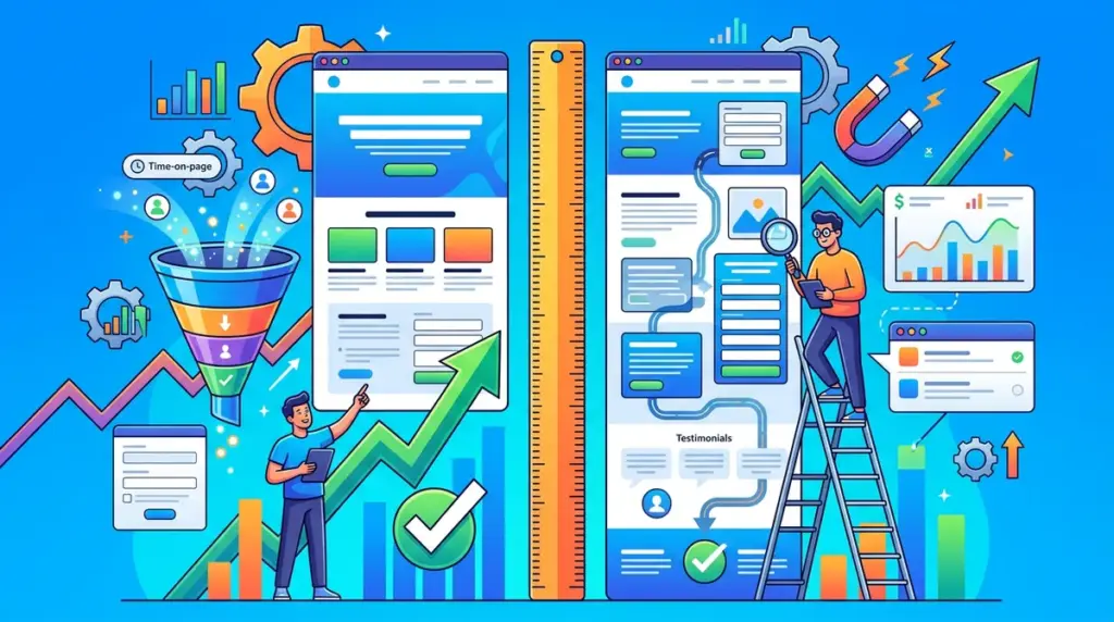
The debate over landing page length usually centers on a false dichotomy: short for speed versus long for persuasion. In reality, the optimal length of a landing page is determined by the friction of the ask and the awareness level of the visitor. A 3,000-word sales letter for a $7 lead magnet will crater your conversion rate, just as a minimalist "Sign Up" button for a $20,000 enterprise SaaS contract will fail to build the necessary trust. To determine the correct length, you must map your page depth to the psychological weight of the decision you are asking the user to make. To determine the correct length, you must map your page depth to the psychological weight of the decision you are asking the user to make, which is a key aspect of landing page optimization.
The Friction-Incentive Ratio
Every landing page operates on a scale of friction versus incentive. Friction includes the price point, the number of form fields, the complexity of the product, and the perceived risk of the transaction. Incentive is the perceived value of the solution. As friction increases, the length of the page must increase to provide enough information to balance the scale.
Short-form pages (200–500 words) work best when the friction is negligible. If you are offering a free checklist, a webinar registration, or a low-cost impulse buy, brevity is an asset. The user already understands the value proposition; extra copy only serves as a distraction that increases the "time to action."
Long-form pages (1,000+ words) are mandatory when the friction is high. This includes high-ticket services, complex technical products, or industries where trust is the primary barrier to entry, such as financial services or healthcare. Here, the length isn't about filling space; it is about preemptively answering every objection that would otherwise prevent a conversion.
Mapping Length to Eugene Schwartz’s Awareness Stages
Your traffic source dictates how much explaining you need to do. A visitor coming from a "Buy [Product Name]" search query is "Product Aware" and requires less convincing than a visitor from a broad "How to improve ROI" search who is only "Problem Aware."
Unaware and Problem Aware Visitors
These users require significant education. You cannot ask for a sale or a high-intent lead until you have defined the problem, agitated the pain points, and positioned your solution as the logical fix. This requires a long-form structure that follows a classic narrative arc: Problem, Agitation, Solution, Proof, and Action.
Solution and Product Aware Visitors
These visitors are often comparing you against competitors. The page should be medium-length, focusing heavily on differentiators, feature sets, and specific case studies. They don't need a 500-word introduction on why their problem matters—they already know. They need to know why your specific mechanism is superior.
Pro Tip: Use heatmapping tools to identify "dead zones" where users stop scrolling. If 70% of your traffic drops off before reaching the testimonial section, your page is either too long for the offer's value or your middle-of-page copy lacks the "hooks" necessary to maintain interest.
Essential Elements That Dictate Page Depth
If you are struggling to decide what to cut or keep, evaluate these four components. If any of these are missing from a high-stakes offer, your page is likely too short.
- Social Proof Density: A single testimonial is rarely enough for a B2B service. You need a mix of logos, video testimonials, and data-backed case studies. Each addition increases page length but significantly lowers the "risk" friction.
- Objection Handling: Every buyer has a "No" in their head. A long-form page allows you to address these via an FAQ section or "Who this is NOT for" copy.
- Risk Reversal: Guarantees, trial periods, and "cancel anytime" clauses need prominent placement. In complex funnels, these require detailed explanation to be believable.
- The Visual Narrative: Sometimes length is created by white space and large imagery. High-end lifestyle brands or complex software often use "scroll-telling" where large visuals dictate a longer page to ensure the UI/UX feels premium rather than cluttered.
The "Fold" Myth and Modern Scroll Behavior
The "above the fold" rule is often misinterpreted. While your most important value proposition and Call to Action (CTA) should be visible immediately, users are conditioned to scroll. Forcing too much information into the top 600 pixels creates visual clutter that increases cognitive load and drives users away.
Instead of fearing length, focus on "visual cues" that encourage scrolling. Use directional arrows, overlapping elements, or progress bars. A long page that is well-structured with clear H2 and H3 headings is easier to digest than a short, cramped page that feels like a wall of text.
Data-Driven Trimming: When to Shorten Your Page
More is not always better. If your conversion rate is low despite high traffic, you may be over-explaining. This is common in "Lead Gen" funnels where the goal is simply to get a phone number for a sales rep to follow up. In this scenario, the landing page only needs to sell the *appointment*, not the entire service. If your page attempts to close the deal entirely, you may be scaring off prospects who aren't ready for that level of commitment yet.
Best for: Low-intent top-of-funnel offers. Keep the copy focused strictly on the immediate benefit of the download or signup, and leave the deep-dive education for the email nurture sequence.
Auditing Your Current Page Length
To optimize your current assets, follow this three-step audit process to ensure your length matches your market's needs.
First, analyze your traffic source. If 80% of your traffic is from retargeting ads, you can likely cut 40% of your introductory copy. These users already know who you are; get straight to the offer. Second, look at your form completion rate. If people are landing on the page but not starting the form, you haven't built enough value (add length/proof). If they start the form but don't finish, the friction of the form exceeds the incentive (shorten the form or add "micro-incentives" near the CTA).
Finally, run a "squint test" on your mobile view. A medium-length desktop page becomes an endless marathon on a smartphone. Ensure your mobile version uses accordions for FAQs and collapses secondary information to keep the "Time to CTA" manageable for thumb-scrolling users.
Landing Page Strategy FAQ
Does a longer page hurt my SEO?
Generally, no. Search engines prefer "thin" content less than comprehensive content. However, for a landing page, the primary goal is conversion, not organic ranking. If you need a page to rank, it will likely need to be longer (1,500+ words) to satisfy search intent, but you must balance this with a clear, recurring CTA so the conversion goal isn't lost in the information.
Should I put the CTA at the bottom or the top?
Both. On a long-form page, you should have a "sticky" header CTA or repeat the button after every major section (e.g., after the features, after the testimonials, and at the very bottom). This ensures that the moment a user is convinced, they don't have to hunt for the exit point.
Is there a maximum word count for landing pages?
There is no hard limit, but diminishing returns usually set in after 3,000 words unless you are selling a highly technical or controversial product. Most high-performing B2B landing pages sit between 800 and 1,200 words, while B2C lead magnets often thrive under 400 words.