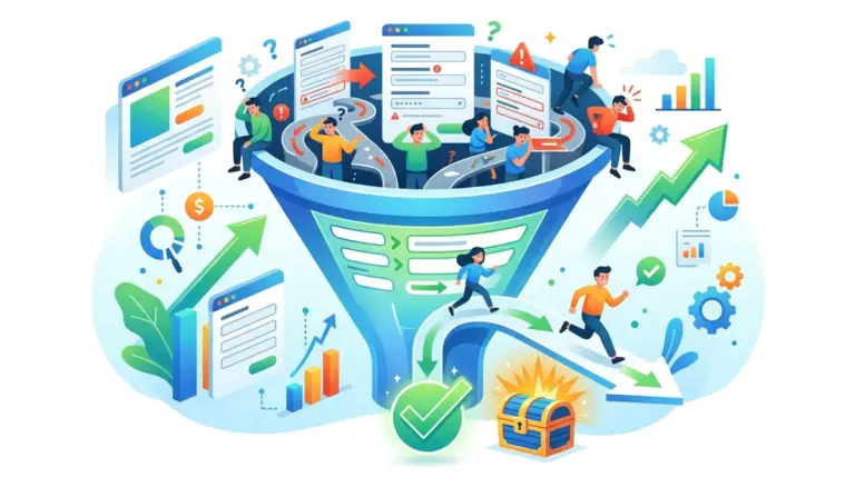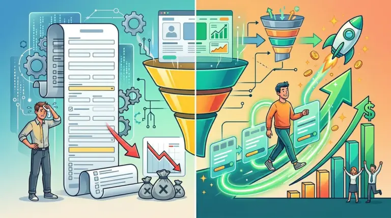
The tension between marketing and sales usually centers on a single variable: form friction. Marketing wants the lowest possible barrier to entry to maximize lead volume and prove campaign ROI. Sales demands high-intent, pre-qualified data to avoid wasting time on "tire kickers." The number of form fields you choose is the physical manifestation of this conflict. Every field added is a tax on your conversion rate, yet every field removed increases the noise in your CRM. Finding the "best" number isn't about following a universal rule; it is about calibrating friction to match the value of your offer and the capacity of your sales team.
The Friction-to-Value Ratio
Before selecting a form length, you must audit the perceived value of the asset behind the form. A 10-field form for a 2-page PDF will fail because the "cost" (time and privacy) exceeds the "reward." Conversely, a 1-field form for a complex enterprise software demo often generates low-quality leads that cost more to filter manually than they are worth. You are looking for the point where lead quality and lead volume intersect to produce the lowest Cost Per Qualified Lead (CPQL), not the lowest Cost Per Lead (CPL).
1. The Single-Field Lead Magnet
The single-field form, almost exclusively asking for an email address, is the ultimate tool for top-of-funnel velocity. By removing the need for a name, phone number, or company details, you eliminate nearly all cognitive load. This configuration relies on the "foot-in-the-door" technique, where the initial low-friction conversion allows you to nurture the lead and collect more data later via progressive profiling or email tracking. It is the purest expression of quantity over quality.
Best for: Newsletter signups, gated blog posts, and low-stakes lead magnets like checklists or templates.
Pros: Maximizes conversion rates on mobile devices where typing is difficult; minimizes abandonment due to privacy concerns.
Cons: Provides zero context for sales teams; requires significant backend automation to enrich the data or qualify the lead through behavior.
Verdict: Use this only when your primary goal is building a massive remarketing audience or an email list where the cost of a "bad" lead is near zero.
2. The Two-Field Personalization Form
Adding a "First Name" field to the email requirement changes the dynamic of the relationship. This second field allows for immediate personalization in follow-up sequences, which can increase email open rates by up to 20%. In terms of friction, the jump from one to two fields is statistically negligible, but the psychological impact of providing a name signals a slightly higher level of commitment from the user.
Best for: Webinar registrations and B2C service inquiries where a personal touch is required in the first 24 hours.
Pros: Enables personalized automation; allows for basic "Dear [Name]" filtering to strip out obvious bot submissions.
Cons: Still lacks professional context (company, role, or budget) for B2B environments.
Verdict: This is the baseline for any brand that intends to use email marketing as a primary conversion driver; never settle for just an email if you plan to send more than three follow-ups.
3. The Three-Field Standard
The "Name, Email, Company" or "Name, Email, Phone" trio is the most common configuration in B2B marketing. It strikes a balance between speed and utility. By asking for a company name, you allow your sales team to perform a quick LinkedIn or ZoomInfo search to qualify the account before reaching out. If you swap "Company" for "Phone," you move into a high-urgency model where the goal is a rapid callback.
Best for: Mid-tier gated content like whitepapers or industry reports.
Pros: Provides enough data for basic lead scoring; fits comfortably above the fold on most mobile landing pages.
Cons: Phone fields at this stage often lead to a 25% drop in conversions as users are wary of unsolicited sales calls.
Verdict: If you use three fields, prioritize "Company Name" over "Phone Number" unless your fulfillment process requires a call within 5 minutes.
4. The Four-Field SaaS Framework
For SaaS companies, the four-field form usually includes First Name, Last Name, Work Email, and Company Name. The distinction of "Work Email" is critical here. By explicitly asking for a business address, you filter out Gmail and Yahoo accounts, which often correlate with lower intent or smaller deal sizes. This configuration is the tipping point where friction begins to serve as a useful filter rather than just a deterrent.
Best for: Free trial signups and "Watch Demo" requests for mid-market software.
Pros: Ensures data hygiene by splitting names for CRM entry; filters out non-professional leads via email validation.
Cons: Last Name is often redundant for early-stage leads and adds an extra click that doesn't significantly improve lead scoring.
Verdict: This is the most efficient setup for companies using automated lead routing software that relies on clean name and company data.
5. The Five-Field Qualification Form
The five-field form typically adds a "Job Title" or "Company Size" dropdown. This is a strategic move to assist sales development reps (SDRs) in prioritizing their daily outreach. By forcing the user to select a category, you are trading a 10-15% decrease in total submissions for a 20% increase in lead relevancy. The dropdown format is essential here; never use an open text field for company size or job title if you want usable data.
Best for: High-volume B2B lead generation where the sales team is overwhelmed by low-quality leads.
Pros: Allows for instant lead routing to specific departments (e.g., Enterprise vs. SMB reps); provides immediate insight into the lead's authority.
Cons: Dropdowns can feel "corporate" and slow down the user experience on mobile browsers.
Verdict: Use this when your cost per lead is low but your sales team's "trash rate" is higher than 50%.
6. The Seven-Field Intent Filter
Once you reach seven fields, you are no longer trying to capture everyone. You are actively trying to discourage people who aren't serious. This form usually includes Name, Email, Phone, Company, Job Title, Industry, and a "How can we help?" text area. This is a high-friction environment that requires a high-value promise to succeed. If someone fills this out, they are a high-intent prospect.
Best for: "Request a Quote" or "Book a Consultation" pages for high-ticket services ($10k+).
Pros: Dramatically reduces the time spent on discovery calls because the discovery is partially done on the form.
Cons: High abandonment rates; requires a very strong brand presence to convince users to spend 2-3 minutes on the form.
Verdict: Only deploy this on bottom-of-funnel pages where the prospect is already convinced they need a solution and are just comparing providers.
7. The Multi-Step Progression
The multi-step form isn't a specific number of fields, but a psychological hack for high field counts. By breaking 10 fields into three steps (e.g., 3 fields, 4 fields, 3 fields), you utilize the "Sunk Cost Fallacy." Once a user completes the first step, they are significantly more likely to finish the rest to avoid "wasting" the effort they already put in. This format often outperforms a single-step 5-field form despite having more total fields. This format often outperforms a single-step 5-field form despite having more total fields, showing how multi-step form outperforms a single-step.
Best for: Complex services like insurance, mortgage applications, or detailed project scopes.
Pros: Reduces initial cognitive load; allows you to capture at least an email address in step one even if the user abandons step two.
Cons: Requires more technical setup and careful UX design to ensure the "Next" buttons work flawlessly on all devices.
Verdict: If you need more than five pieces of information, a multi-step form is mandatory to maintain a conversion rate above 5%.
8. The Conditional Logic Form
Conditional logic allows the form to expand or contract based on user input. For example, if a user selects "I'm a freelancer," the form might only show three fields. If they select "I'm an Agency Owner," it might expand to ask about team size and current revenue. This keeps the field count at the absolute minimum required for that specific persona, ensuring that no user sees a field that isn't relevant to them.
Best for: Companies with diverse audiences (e.g., a tool that serves both individuals and enterprises).
Pros: Highly relevant user experience; keeps forms looking short while still collecting deep data where appropriate.
Cons: Can be frustrating if the logic isn't perfect; users may feel "tricked" when the form suddenly grows in length.
Verdict: This is the most sophisticated way to handle lead qualification without sacrificing the conversion rates of smaller prospects.
9. The Zero-Field Social Auth
Social authentication (Login with Google, LinkedIn, or GitHub) technically has zero fields to type, but it grants the company access to a wealth of verified data. This is the ultimate friction-killer. By clicking one button, the user submits their name, verified email, job title, and company profile. It is the most accurate data you can get because it comes directly from a third-party verified source.
Best for: SaaS products, developer tools, and professional networking platforms.
Pros: Near-perfect data accuracy; one-click conversion; eliminates the "fake email" problem.
Cons: Some corporate firewalls block social auth; users may be hesitant to grant data permissions to an unknown brand.
Verdict: Always offer this as an alternative to a traditional form; it typically captures the highest-quality leads with the least effort.
10. The Conversational UI (One Field at a Time)
Conversational forms (like Typeform or chat-style interfaces) present one question at a time. This changes the user's perception of "form length" into a "conversation." While the total number of fields might be high (8-10), the user only ever focuses on one task. This focus prevents the "scanning" behavior where users look at a long form and decide it's too much work before they even start.
Best for: Quizzes, onboarding flows, and brand-heavy landing pages.
Pros: Extremely high completion rates for long-form data collection; feels modern and interactive.
Cons: Can be annoying for "power users" who want to fill out information quickly; hard to see how much progress is left without a progress bar.
Verdict: Use this for B2C lead gen or "Discovery Quizzes" where the process of filling out the form is part of the brand experience.
11. The Ten-Plus Enterprise RFP
In certain industries, a short form is actually a red flag. For complex Request for Proposals (RFPs) or high-end consulting, a 10-15 field form signals that the provider is thorough and professional. It asks for project timelines, budgets, technical requirements, and current pain points. This is a deliberate barrier to entry designed to protect the time of senior partners or expensive engineers.
Best for: Custom manufacturing, enterprise consulting, and specialized legal or financial services.
Pros: Eliminates 99% of unqualified leads; provides a full brief for the sales team before the first call.
Cons: Extremely low volume; requires a very high-traffic site or highly targeted ad spend to generate enough data points.
Verdict: Only use this if your business model cannot handle more than 5-10 new leads per month due to fulfillment constraints.
12. The Data-Enriched Short Form
This strategy uses a 2 or 3-field form (typically just Email and Company) but connects to a real-time enrichment API. As the user types their email, the system pulls their LinkedIn profile, company revenue, tech stack, and location in the background. You get 20+ fields of data while the user only sees two. This is the current "gold standard" for high-growth B2B companies.
Best for: Modern B2B SaaS and high-volume demand generation teams.
Pros: The highest possible conversion-to-data ratio; keeps the UI clean while providing sales with deep intelligence.
Cons: Expensive (requires subscriptions to enrichment tools); enrichment data is not always 100% accurate or up-to-date.
Verdict: If you have the budget for the API calls, this is the most effective way to maximize both volume and quality simultaneously.
How to Choose the Right Field Count
To determine your ideal field count, you must calculate your "Lead Processing Cost." If it takes an SDR 15 minutes to research and disqualify a bad lead, and you get 100 bad leads a month, you are losing 25 hours of high-value labor. If adding two fields reduces those bad leads by 80% while only reducing good leads by 5%, the math favors the longer form. Always test in increments. Move from 3 fields to 5, or 5 to 4, and measure the impact on the "Sales Qualified Lead" (SQL) rate, not just the raw conversion rate. The goal is to maximize the total number of SQLs, which often requires more friction than a standard CRO audit would suggest. Always test in increments to measure the impact on the SQL rate, not just the raw conversion rate.
FAQ
Does placeholder text count as a field?
No, but it can increase cognitive load if used incorrectly. Use labels above the fields instead of placeholders inside them, as placeholders disappear when the user starts typing, forcing them to rely on short-term memory.
Should I use a CAPTCHA on my forms?
Avoid visual CAPTCHAs if possible, as they are a major friction point. Use "honeypot" fields (hidden fields that only bots fill out) or invisible reCAPTCHA to filter spam without bothering human users.
Does the "Phone Number" field always hurt conversions?
Almost always. Most studies show a 5% to 25% drop in conversions when a phone number is required. If you must have it, make it optional or explain exactly why you need it (e.g., "To send a text confirmation").
Is "Work Email" better than "Email"?
In B2B, yes. It signals that you are a professional service and allows for better data enrichment. However, be prepared for a slight dip in volume from users who prefer to use personal accounts for initial research.
Should I show all fields at once or use a "Next" button?
If you have more than five fields, use a multi-step format. If you have four or fewer, keep them on one screen to show the user how easy the process is.