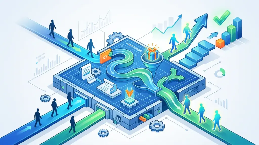
Most homepages function as expensive, ego-driven brochures. They are designed to satisfy internal stakeholders rather than solve the immediate friction of a visitor. A high-converting homepage is not a welcome mat; it is a high-speed sorting machine. Its sole purpose is to identify the visitor's intent and route them to the specific solution, product, or offer that solves their problem with the least amount of cognitive load. When a homepage fails, it is usually because it tries to say everything to everyone, resulting in a generic message that resonates with no one.
Engineering the Hero Section for the Five-Second Rule
The hero section is the most valuable real estate on your site. Within five seconds, a visitor must understand exactly what you offer, who it is for, and what the next step is. If they have to scroll to find your value proposition, you have already lost a significant percentage of your mobile traffic. A high-converting hero section requires three distinct elements working in tandem.
The Clarity-First Headline
Stop using "clever" wordplay. If you sell enterprise CRM software for manufacturing, your headline should not be "Reimagine Your Potential." It should be "The CRM Built Specifically for Mid-Market Manufacturers." Use a What + Who + Outcome framework. For example: "Automated Bookkeeping (What) for Freelance Designers (Who) to Save 10 Hours a Week (Outcome)." This removes the mental tax of deciphering your brand’s personality before understanding its utility.
The Sub-Headline as Risk Reversal
While the headline states the promise, the sub-headline must handle the primary objection. If the primary objection in your industry is a difficult setup process, your sub-headline should mention "Up and running in 15 minutes with zero technical overhead." This is where you provide the concrete evidence that supports your main claim.
The Primary Call to Action (CTA)
Your primary CTA should be a high-contrast button that stands out from the background. Avoid "Submit" or "Learn More." Use action-oriented language that describes the result of clicking. "Start Your Free Audit," "Get My Custom Plan," or "View the Inventory" are far more effective because they tell the user exactly what they are getting in exchange for their click.
Quantifying Trust Through Strategic Social Proof
Social proof is often treated as a checkbox—dumping a row of logos or a few vague quotes at the bottom of the page. To drive conversions, social proof must be placed at the point of highest friction. This is usually directly beneath the hero CTA or right before a pricing section.
- Logo Walls: Only use recognizable logos that your specific target audience respects. If you are selling to CTOs, use logos of technical firms, not generic consumer brands.
- Specific Testimonials: A testimonial that says "Great service!" is useless. Use testimonials that highlight a specific metric or solved problem. Example: "We reduced our customer churn by 22% in the first 90 days using this framework."
- Trust Signals: Include badges for security (SOC2, SSL), industry certifications, or "as seen on" mentions from reputable publications to build immediate authority.
Pro Tip: Avoid using generic stock photos of "happy customers." Heatmap data consistently shows that users ignore stock imagery. Instead, use real photos of your clients or screenshots of the product in action. Authenticity outperforms polish every time in a CRO context.
The "F-Pattern" and Information Architecture
Users do not read homepages; they scan them. Eye-tracking studies show that most users follow an "F-pattern," scanning across the top and then down the left side of the page. Your information architecture must cater to this behavior. Place your most critical information—your USP and primary CTA—along these scan lines.
Every section below the fold should address a specific stage of the buyer’s journey. Start with the "Problem" (the pain points your audience feels), move to the "Solution" (how your product fixes those pains), and then provide the "Evidence" (case studies or data). This logical progression builds a narrative that leads the user toward the final conversion point at the bottom of the page.
Deploying a Multi-Path Conversion Strategy
Not every visitor is ready to buy on their first visit. A high-converting homepage accounts for different levels of intent by offering a primary and a secondary path. If your primary goal is a "Book a Demo" request, your secondary goal should be a lower-friction offer, such as a whitepaper, a free tool, or a newsletter signup.
Best for High-Intent Traffic: Direct links to product pages, "Get Started" buttons, and pricing tables. These should be prominent in the navigation and the hero section.
Best for Low-Intent Traffic: Resource libraries, "How it Works" videos, and detailed case studies. These allow the user to self-educate without the pressure of a sales conversation.
Eliminating Friction in Navigation and Footers
A common mistake is over-complicating the navigation menu. Every link in your header is a potential exit point that distracts from your primary goal. Remove the "Home" link (users know clicking the logo takes them home) and limit your top-level navigation to 4–6 essential items. Use a "sticky" header so the CTA is always visible as the user scrolls, ensuring they never have to hunt for a way to convert.
The footer should not be a junk drawer. It is the "safety net" for users who have scrolled to the end without finding what they need. Organize it logically with columns for Products, Company, and Resources, and include a final "Catch-all" CTA for those who are still undecided.
Audit Your Homepage for Conversion Leaks
To move from a standard homepage to a high-converting asset, you must move beyond design and into data-driven iteration. Start by identifying where users are dropping off. Are they clicking your hero CTA but bouncing on the next page? That indicates a message-match problem. Are they scrolling to the bottom without clicking anything? That suggests your content isn't addressing their specific pain points.
Run a simple 5-second test with someone outside your company. Show them your hero section and ask what the company does. If they can't answer, your copy is too vague. Next, check your mobile load speeds; a one-second delay in mobile load time can impact conversion rates by up to 20%. Finally, ensure your forms are as short as possible. Every additional field you add to a homepage lead form decreases the likelihood of completion.
Homepage Conversion FAQ
How long should a high-converting homepage be?
The length depends on the complexity of the offer. A simple consumer product may only need a short, punchy page. An enterprise SaaS solution with a high price point requires a longer page to handle more objections, provide deeper social proof, and explain complex features.
Should I use a video in my hero section?
Only if it serves a specific purpose, such as demonstrating a complex UI or showing a physical product in motion. Avoid auto-playing videos with sound, as they increase bounce rates. If you use video, ensure it is optimized for fast loading and does not distract from the primary headline and CTA.
Is SEO more important than CRO for a homepage?
They should work together, but for a homepage, CRO often takes precedence. While you want to rank for your brand name and core category keywords, the homepage's job is to convert the traffic you’ve already earned. Do not sacrifice a clear, high-converting headline just to cram in extra keywords.
How many CTAs should I have on the homepage?
You should have one primary action you want the user to take, repeated at several points (Hero, mid-page, and bottom). You can include 1–2 secondary CTAs for lower-intent users, but they should be visually distinct (e.g., an outline button vs. a solid fill) so they do not compete with your main goal.