

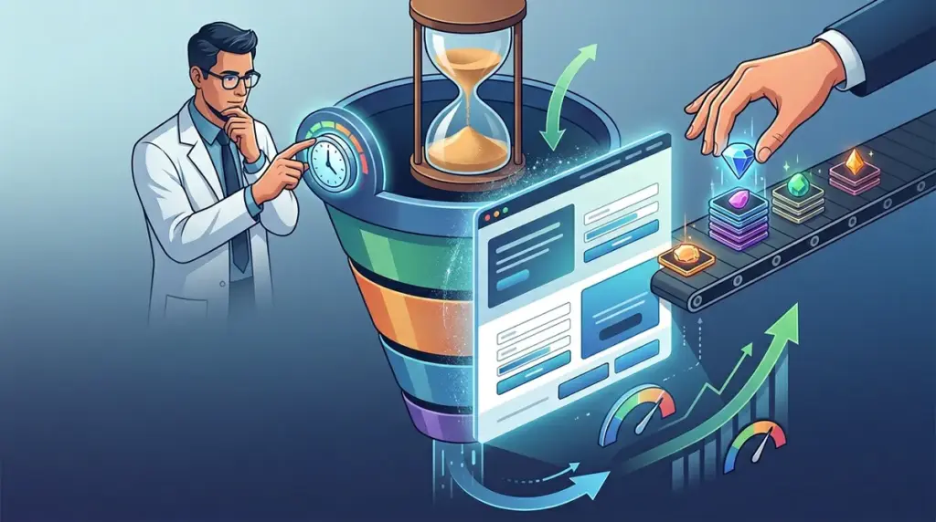
Most conversion rate optimization efforts fail not because the offer is weak, but because the prospect feels they can decide later. In the world of high-stakes landing pages, "later" is the graveyard of revenue. Urgency and scarcity are the primary tools used to solve this inertia, yet they are frequently deployed with such heavy-handedness that they trigger immediate skepticism. When a visitor sees a countdown timer that resets upon every page refresh, you haven't created urgency; you've signaled that your brand is untrustworthy.
To drive a genuine conversion lift, these psychological triggers must be anchored in reality. You are not trying to trick the user into a panic; you are providing a logical reason to act immediately to secure a specific value or avoid a tangible loss. This distinction separates high-performing funnels from spammy "get rich quick" schemes.
The Structural Difference Between Scarcity and Urgency
While often used interchangeably, these two levers operate on different psychological planes. Understanding the nuance allows you to apply the right pressure at the right stage of the funnel.
- Scarcity is a function of quantity. It suggests that the supply is limited, whether by physical stock, service capacity, or exclusive access. It leverages the "fear of missing out" (FOMO) by highlighting that the opportunity is finite.
- Urgency is a function of time. It places a hard deadline on the decision-making process. It forces the user to prioritize the offer against other competing tasks by creating a window of opportunity that will eventually close.
Best for: E-commerce brands should lead with scarcity (stock levels), while SaaS and service-based agencies should lead with urgency (onboarding windows or limited-time bonuses).
Implementing Verifiable Scarcity in High-Ticket Funnels
In B2B or high-ticket service environments, generic "limited spots available" claims are often ignored. To make scarcity work, you must define the constraint. If you are an agency, the constraint is your team’s bandwidth. If you are a SaaS provider, the constraint might be a beta-testing cohort or a specific implementation window.
Instead of vague claims, use dynamic data to show real-time availability. For a webinar or a live training session, showing "14 of 50 seats remaining" is far more effective than "Sign up before seats run out." The specificity provides social proof and validates the scarcity claim simultaneously. When the user sees a specific, non-rounded number, the brain perceives it as a data point rather than a marketing slogan.
The Logic of "Helpful" Urgency
Urgency feels spammy when it is arbitrary. It feels helpful when it assists the user in achieving their goal faster. A classic example is the shipping countdown used by major retailers: "Order within the next 42 minutes to receive this by Tuesday." This isn't just a sales tactic; it is a logistical fact that helps the user plan their purchase. It creates urgency by highlighting a benefit that will be lost if the user delays.
For lead generation and digital products, you can replicate this by tying the deadline to a specific outcome. For example, "Join the Q3 cohort by Friday to ensure your site is optimized before the Black Friday traffic surge." Here, the deadline is tied to the user's business cycle, making the urgency feel relevant and consultative rather than predatory.
Pro Tip: Avoid the "Evergreen Timer" trap. If a user returns to your landing page from a different device and sees a different countdown, your credibility is destroyed. Use server-side tracking or cookie-based persistence to ensure that deadlines remain consistent for individual users across sessions.
Tiered Incentives: The "Soft" Deadline
One of the most effective ways to use urgency without looking like a bargain-bin retailer is through tiered incentives. Rather than the offer disappearing entirely, the value of the offer diminishes over time. This is common in event marketing but works exceptionally well for SaaS launches and service packages.
Phase 1: Early Bird pricing + Bonus Implementation Call (Ends in 48 hours).
Phase 2: Early Bird pricing only (Ends in 96 hours).
Phase 3: Standard pricing.
This structure allows you to maintain multiple touchpoints with your email list or retargeting audience. Each transition provides a legitimate reason to reach out without sounding repetitive. You aren't "pestering" them to buy; you are "reminding" them that the current value proposition is about to change.
Identifying and Removing False Friction
Nothing kills a conversion faster than "fake" urgency that the user can see through. If you are using these elements, audit your pages for the following red flags:
- The Perpetual Sale: If your "24-hour flash sale" has been running for three weeks, your audience will stop believing your deadlines. Use specific dates (e.g., "Ends October 14th") rather than relative timeframes.
- The Ghost Buyer: Avoid those small pop-ups that say "John from Delaware just bought this" unless they are pulling from a real, verified API. Users are increasingly savvy and can often spot the repetitive patterns of fake social proof plugins.
- The False Stock Counter: If every item on your site says "Only 2 left in stock," it looks like a technical error or a lie. Only show stock levels when they drop below a significant threshold (e.g., under 10).
Technical Execution for Conversion Lift
To implement these triggers effectively, the UI must support the psychology. On mobile, where attention spans are shortest, urgency elements should be pinned or highly visible near the Call to Action (CTA). On desktop, scarcity cues can be placed near the price point to justify the investment.
For form-heavy pages, placing a subtle reminder of the deadline near the "Submit" button can reduce form abandonment. It serves as a final nudge for users who have started the process but are hesitating at the point of data entry. The goal is to reduce the "friction of thought"—the moment where the user stops to wonder if they should check a competitor or wait until tomorrow.
Auditing Your Urgency Strategy
Before launching your next campaign, run your urgency and scarcity elements through this three-point checklist. If you cannot answer "yes" to all three, your elements are likely perceived as spam.
1. Is the constraint real? Can you justify why the price is rising or why the stock is limited if a customer asked?
2. Is the benefit clear? Does the user understand exactly what they gain by acting now, or what specific advantage they lose by waiting?
3. Is the UI consistent? Does the countdown or stock level remain the same across different browsers and sessions for that specific user?
When urgency is rooted in these principles, it stops being a "trick" and becomes a core part of a high-converting user experience. It respects the user's time by providing the necessary pressure to make a decision that benefits their business or lifestyle.
Frequently Asked Questions
Does urgency work for B2B professional services?
Yes, but it must be framed around capacity. Professional services have a natural limit on how many clients they can onboard or manage effectively. Highlighting "2 open slots for November" is a legitimate use of scarcity that reinforces the high-demand nature of your expertise.
What is the best placement for a countdown timer?
For maximum impact, place the timer in a sticky header or immediately adjacent to the primary CTA. It should be visible but not obstructive. If it blocks the actual value proposition or product description, it will increase bounce rates rather than conversions.
Will urgency hurt my brand's long-term reputation?
Only if it is dishonest. If you honor your deadlines—meaning the price actually goes up or the offer actually disappears when the timer hits zero—you build authority. Customers will learn that your "limited time" offers are worth paying attention to, which makes your future marketing more effective.