

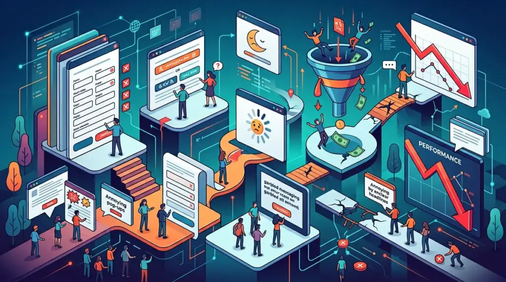
Every dollar spent on customer acquisition is wasted if your landing page acts as a sieve rather than a funnel. Most performance issues aren't the result of a single catastrophic failure, but a cumulative "friction tax" paid across dozens of small, overlooked touchpoints. If your conversion rate is stagnating while your traffic costs rise, you are likely committing several of these 25 structural and psychological errors.
Technical and Structural Performance Leaks
1. Ignoring Largest Contentful Paint (LCP)
If your hero image takes more than 2.5 seconds to stabilize, users bounce before they even read your headline. Conversion rates drop by roughly 4.4% for every additional second of load time. Use WebP formats and prioritize critical CSS to ensure the visual offer appears instantly.
2. Cumulative Layout Shift (CLS) on CTAs
Few things kill trust faster than a button that moves just as a user tries to click it. This often happens when late-loading fonts or banners push content down. Ensure your button containers have defined heights in your CSS to prevent "jumping" layouts.
3. Broken Form Validation Logic
Inline validation should be helpful, not hostile. Error messages that only appear after a user hits "Submit" cause unnecessary friction. Impact: Real-time validation (green checkmarks as they type) can increase form completions by up to 22%.
4. High Time to First Byte (TTFB)
If your server takes 500ms+ just to respond, you’ve lost the battle before the browser even starts rendering. This is often a hosting or database query issue that no amount of front-end optimization can fix.
Messaging and Cognitive Load Errors
5. The Vague "Solution-First" Headline
Avoid headlines like "The Future of Efficiency." Users need to know exactly what you do within three seconds. A high-converting headline addresses the specific pain point or the immediate outcome. Best for: B2B SaaS and service-based businesses.
6. Call-to-Action (CTA) Overload
Presenting "Buy Now," "Learn More," and "Book a Demo" on the same screen creates decision paralysis. Every page should have one primary goal. Secondary actions should be visually de-emphasized or moved to the footer.
7. Ad-to-Page Disconnect
If your Facebook ad promises a "50% Discount" but the landing page talks about "Premium Quality" without mentioning the deal, the user feels misled. This scent-trail breakage is a primary cause of high bounce rates in paid media.
8. Over-Reliance on Stock Photography
Generic photos of people in suits shaking hands signal a lack of authenticity. Use real product screenshots, actual team photos, or specific customer results to build genuine rapport.
Warning: Never run an A/B test without a pre-defined hypothesis. Testing "red vs. blue buttons" without understanding why one might perform better leads to "false positives" that don't scale across your brand.
Friction in the Conversion Path
9. Mandatory Account Creation
For e-commerce, forcing a user to create a password before they can give you money is a conversion killer. Implement "Guest Checkout" as the default. You can always ask them to save their details on the "Thank You" page.
10. Excessive Form Fields
Do you really need their fax number or "How did you hear about us?" at the point of lead capture? Every field added to a form reduces the conversion rate. If you need deep data, use a multi-step form that starts with low-friction questions.
11. Hidden Shipping Costs or Fees
Surprise costs at the final checkout step are the number one reason for cart abandonment. Be transparent about taxes and shipping early in the process, or better yet, roll them into the product price.
12. Lack of "Breadcrumbs" in Multi-Step Funnels
If a user is in a multi-page flow, they need to know how much effort is left. A progress bar reduces anxiety and encourages completion by visualizing the finish line.
Trust and Social Proof Failures
13. Anonymous or Vague Testimonials
"Great service! - John D." carries zero weight. Effective social proof includes a full name, a headshot, a company logo, and a specific, measurable result achieved using your product.
14. Missing Security Signals
Even if you use Stripe or PayPal, users look for SSL padlocks and trust badges (like Norton or BBB) near the "Pay" button. These are psychological safety nets that reduce "buyer's remorse" before the purchase is even made.
15. Failing to Address Objections
Every buyer has a "but." "But will it integrate with my CRM?" "But is there a money-back guarantee?" Use an FAQ section or "Risk Reversal" copy right next to the CTA to neutralize these concerns in real-time.
Mobile User Experience Gaps
16. The "Fat-Finger" Problem
Buttons on mobile must be at least 44x44 pixels. If they are too small or packed too closely together, users will misclick, get frustrated, and leave.
17. Intrusive Interstitials
Pop-ups that cover the entire screen on mobile are not just annoying; they can lead to Google search penalties. Use "slide-ins" or "sticky bars" that don't obstruct the primary content.
18. Non-Optimized Mobile Keyboards
When a user clicks an email field, the "at" symbol (@) should appear. When they click a phone field, the number pad should appear. Failing to set the correct `input type` in your HTML adds unnecessary friction.
Data and Testing Mismanagement
19. Ending Tests Too Early
Reaching "95% statistical significance" doesn't mean the test is over if you've only run it for three days. You must account for business cycles (weekends vs. weekdays) to avoid making decisions based on temporary data outliers.
20. Ignoring Qualitative Data
Heatmaps and session recordings tell you where users get stuck, while A/B tests only tell you which version they preferred. Use tools like Microsoft Clarity to see where users are "rage-clicking."
21. Testing Too Many Variables Simultaneously
If you change the headline, the hero image, and the CTA color at once, you won't know which change caused the lift (or the drop). This is why isolated multivariate testing is reserved for high-traffic sites.
Post-Click and Retention Errors
22. Dead-End Thank You Pages
The moment someone converts is when they are most engaged. Don't just say "Thanks." Offer a related resource, a discount for a second purchase, or an invitation to follow your social channels.
23. Slow Internal Search Results
For large e-commerce sites, if the internal search returns "No results found" for a common query, that's a lost sale. Use "Did you mean?" logic or show popular alternatives.
24. Ghost Buttons
Transparent buttons with thin outlines may look "clean," but they often disappear into the background. Your primary CTA should be the most high-contrast element on the page.
25. Ignoring the Exit-Intent Opportunity
If a user is moving their mouse toward the "back" button, an exit-intent overlay offering a lead magnet or a final discount can recover 5-10% of abandoning traffic.
Auditing Your Funnel for Quick Wins
- Run your landing page through PageSpeed Insights and prioritize the "Opportunities" section.
- Watch 10 session recordings of users who abandoned their carts to identify technical friction.
- Rewrite your main headline to focus on a specific, measurable benefit rather than a feature.
- Consolidate your forms to the absolute minimum number of fields required for a follow-up.
Frequently Asked Questions
What is a good conversion rate for a landing page?
While it varies by industry, a "good" rate is typically between 2% and 5%. High-performing pages in specific niches like SaaS or insurance often see rates of 10% or higher through aggressive optimization and offer alignment.
Should I prioritize mobile or desktop CRO?
Check your analytics. If more than 50% of your traffic is mobile, you should be designing "mobile-first." Mobile users have shorter attention spans and higher friction sensitivity, making mobile optimization the higher-leverage activity.
How long should I run an A/B test?
Most experts recommend running a test for at least two full business cycles (usually two weeks) to account for variations in user behavior across different days of the week, regardless of when you hit statistical significance.
Is social proof always necessary?
Yes, but the *type* of social proof matters. For low-cost impulse buys, "number of customers" works well. For high-ticket B2B services, deep-dive case studies and recognizable logos are mandatory for building the necessary trust.